


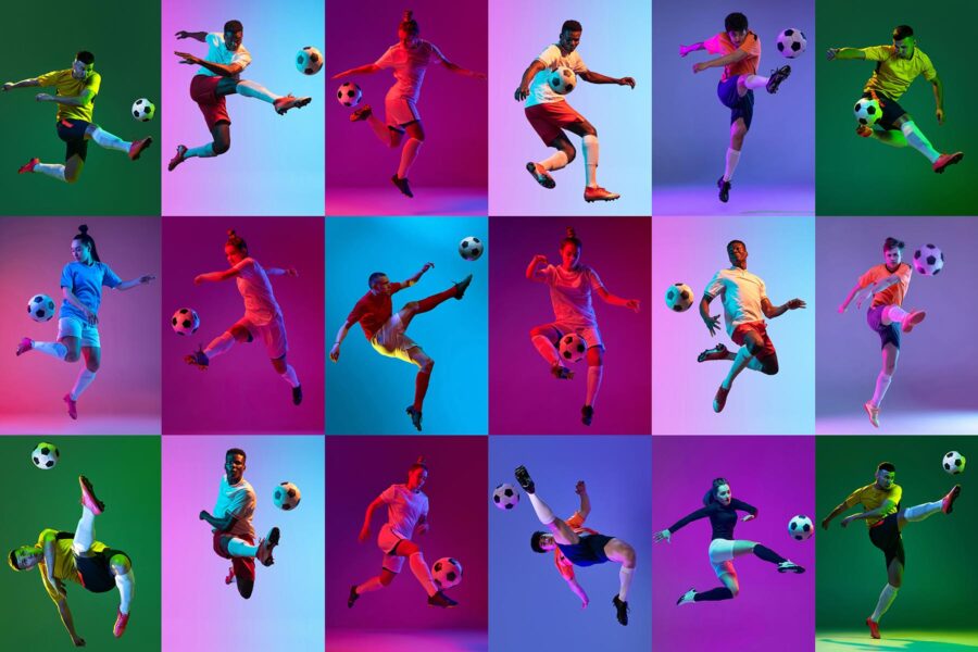
More Than Just a Color Choice
When a team steps onto the field, what’s the first thing you notice?
It’s not the formation, not the footwork—not yet. It’s the jersey. The color. The design. The message it sends before the ball ever moves.
Color isn’t just aesthetic. It’s emotional. It shapes perception. It impacts confidence. It even influences performance—both for the team wearing it and the one facing it.
So, how do you choose the right color for your squad? Not just what looks good, but what feels right? Let’s explore the psychology behind color in soccer jerseys—and how to make it work for your team.
Red: Commanding, Fierce, and Unmistakable
Red is the color of aggression, dominance, and intensity. It’s a primal signal—used in nature to warn, challenge, and intimidate. On the pitch, it carries that same energy.
Teams who wear red often exude confidence. It’s no surprise that some of the world’s most iconic clubs—Liverpool, Manchester United, Bayern Munich—have built legacies in red kits.
Why teams choose red:
- It stands out boldly on the field
- It’s associated with power and momentum
- It can psychologically unsettle opponents
- It energizes players and fans alike
But red isn’t for the faint-hearted. It demands presence. You don’t wear red to disappear—you wear it to dominate.
Blue: Calm Under Pressure, Built for Control
On the opposite end of the spectrum, blue brings a sense of calm authority. It’s stable. Trustworthy. Strategic. It doesn’t shout—it asserts.
Teams in blue often play with poise and precision. Think Chelsea, France, Italy. There’s a quiet strength in blue. A composed confidence that says, “We’ve got this.”
Why blue works on the pitch:
- It promotes clear thinking and focused play
- It’s visually soothing and easy on the eyes
- It reflects tradition and professionalism
- It’s versatile—light blues feel modern, dark blues feel classic
Blue is for teams that don’t need to prove anything. They just show up and go to work.
Black: Bold, Intimidating, and Unapologetic
There’s something undeniably sleek about black jerseys. They don’t scream—they smolder.
Black is associated with mystery, seriousness, and control. It’s often used in alternate kits to change the tone of a game. When a team wears black, it’s like flipping a switch: we’re not here to play nice.
Why black makes a statement:
- It gives off a psychological edge
- It looks sharp, modern, and unshakably cool
- It’s slimming and flattering across body types
- It creates a sense of unity and fearlessness
Black works best when paired with minimalist design. Let the color do the talking.
White: Clean, Classic, and Confident
White is often underestimated. But it’s quietly powerful.
It represents simplicity, clarity, and focus. It doesn’t rely on flash—it lets the play speak for itself. There’s a reason Real Madrid’s all-white kits are iconic. It’s tradition and elegance wrapped into one.
Why white holds its own:
- It reflects light and heat, great for hot weather
- It pairs easily with any accent color
- It signifies discipline, purity, and ambition
- It looks fresh and timeless in photos and highlights
White is for teams that trust their fundamentals. No gimmicks. Just football.
Green: Fresh Energy, Grit, and Growth
Green isn’t the most common jersey color—but that’s part of its charm. It’s natural, earthy, and energetic. It symbolizes growth, renewal, and hustle.
Wearing green says, “We’re different—and proud of it.” Whether it’s forest green or electric lime, the color brings a refreshing edge to the field.
Why green stands out:
- It blends with the field but still pops
- It’s often associated with underdogs or high-energy teams
- It promotes balance and stamina
- It gives off a youthful, spirited vibe
Green jerseys are perfect for teams that want to disrupt the norm—and look good doing it.
Yellow and Gold: Flash, Flair, and Fearlessness
Yellow is all about energy. It’s vibrant. It’s fast. It grabs attention—and doesn’t let go.
Brazil’s iconic kits are proof that yellow can be electric. It’s not a passive color. It demands creativity, motion, and boldness from the players who wear it.
Why yellow works for fearless squads:
- It’s ultra-visible, even in low light
- It symbolizes optimism, speed, and instinct
- It looks dynamic in action shots
- It pairs well with navy, black, or green for contrast
Gold, on the other hand, adds a regal edge. It’s about prestige and excellence. If yellow is the spark, gold is the crown.
Purple, Orange, and Other Wildcards
Then there are the outliers. The unexpected choices. The colors that don’t follow tradition—but leave an impression.
Purple? It’s royal and rare. Used sparingly, it feels elite. Orange? It’s fiery and electric. Think Netherlands or Houston Dynamo—teams that want to make sure you remember them.
These colors aren’t for everyone. But when used right, they’re unforgettable.
Why wildcards can work:
- They create strong brand identity
- They make your team instantly recognizable
- They show personality and creativity
- They break away from the expected
Just make sure the design supports the boldness. A loud color with a loud pattern? That’s a lot to take in. Choose one star of the show—color or design—but not both.
The Role of Contrast and Accent Colors
It’s not just about your main color—it’s what you pair it with. Accent colors can elevate or destroy a jersey’s impact.
A red jersey with black trim feels intense. The same red with white trim? Clean and classic.
Smart contrast does a few key things:
- Improves visibility for numbers and names
- Defines shapes and movement on the field
- Adds depth and balance to the design
- Helps identify home vs. away kits at a glance
Think about legibility. Think about light conditions. And always test your color combos on real fabric—not just a screen.
Cultural and Regional Influence on Color Choice
Color isn’t just psychological—it’s cultural. In some places, white is a wedding color. In others, it’s for mourning. Red may symbolize luck in one country, danger in another.
Consider your community when choosing team colors:
- What do local schools or pro teams wear?
- Are certain colors tied to heritage or tradition?
- Will fans embrace the look—or feel disconnected by it?
Colors tell a story. Make sure yours aligns with the one your team wants to tell.
Closing Thoughts: Let Your Colors Speak For You
Choosing the color of your custom soccer jerseys isn’t just a style decision—it’s a strategic one. It affects how your players feel, how opponents react, and how fans connect.
You’re not just picking a hue. You’re choosing a message. A mood. A mindset. And that message shows up in every sprint, every tackle, every goal celebration.
So don’t just default to what’s available. Think about what fits your squad’s soul. What fires them up. What makes them walk taller the moment they zip it up.
Because when the color feels right? The team moves like they own the pitch.